
Product
My Role
Timeline
Team Size


Designed a logistics platform to streamline supply chain operations and enhance efficiency. Created wireframes, user flows, and a design system while redesigning existing processes based on user research. Collaborated with stakeholders to deliver a seamless and user-focused experience.
The lack of a clear information structure created confusion and inefficiencies. The design had to prioritize intuitive navigation and actionable insights for users managing complex logistics workflows.
I started with a detailed product review to identify key areas for improvement. While inconsistencies were clear, deeper research was needed for real insights. Gaining stakeholder support for this research was a challenge, as they were initially skeptical of its value.

Stage 1: Internal Research
I quickly got up to speed on the project, using session recordings and analytics to pinpoint user pain points. This allowed me to implement impactful improvements with minimal effort.

Stage 2: Collaboration with Internal Teams
I worked with the QA team and customer support to identify recurring issues and user frustrations. I also joined client onboarding sessions to see how users adopted the product in real-world scenarios.

Stage 3: User Research
I used surveys to pinpoint weak spots in the user journey and tested newly implemented features. This was backed by interviews and user observations, gaining stakeholder approval for a user-centered approach.

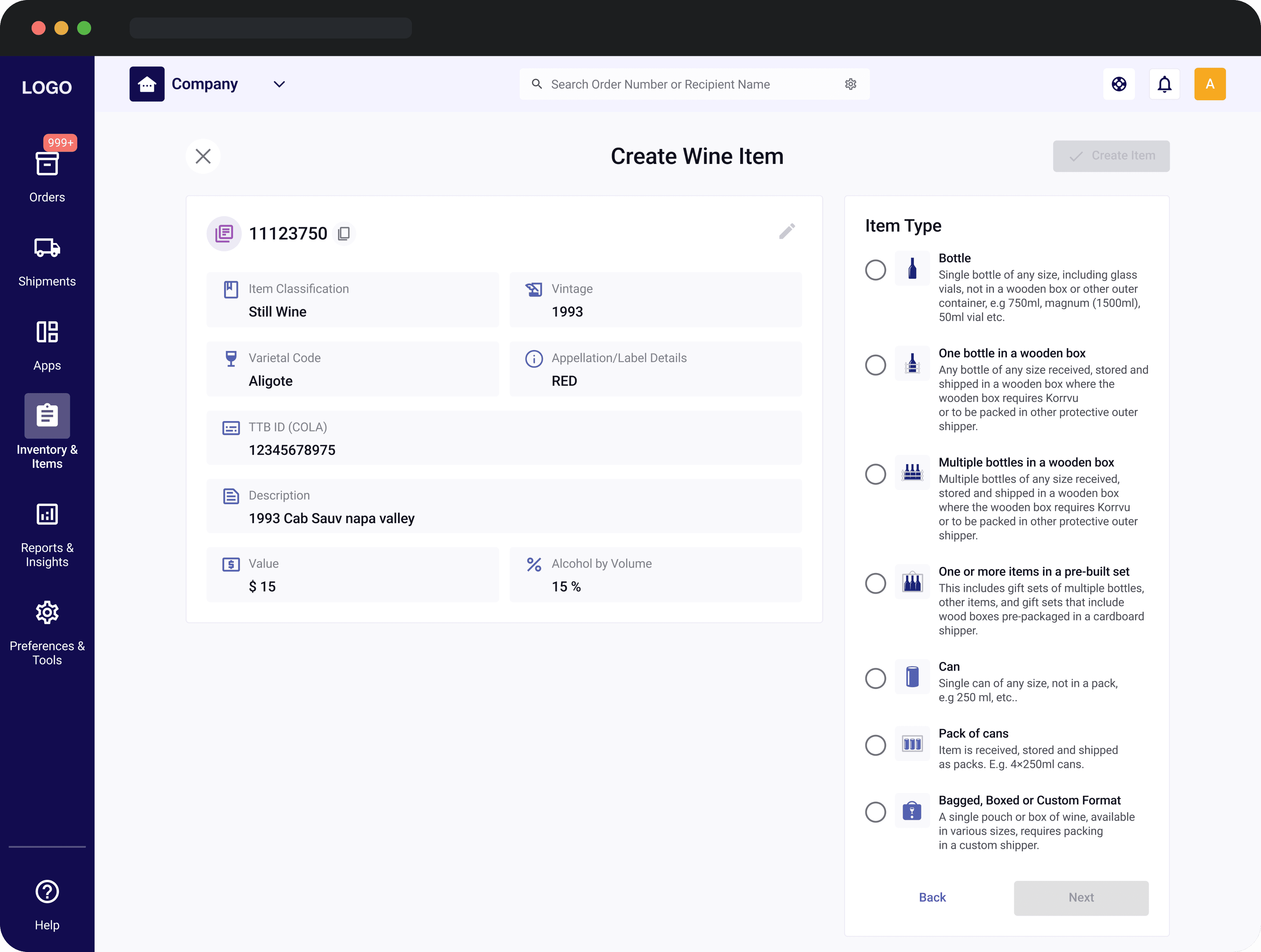
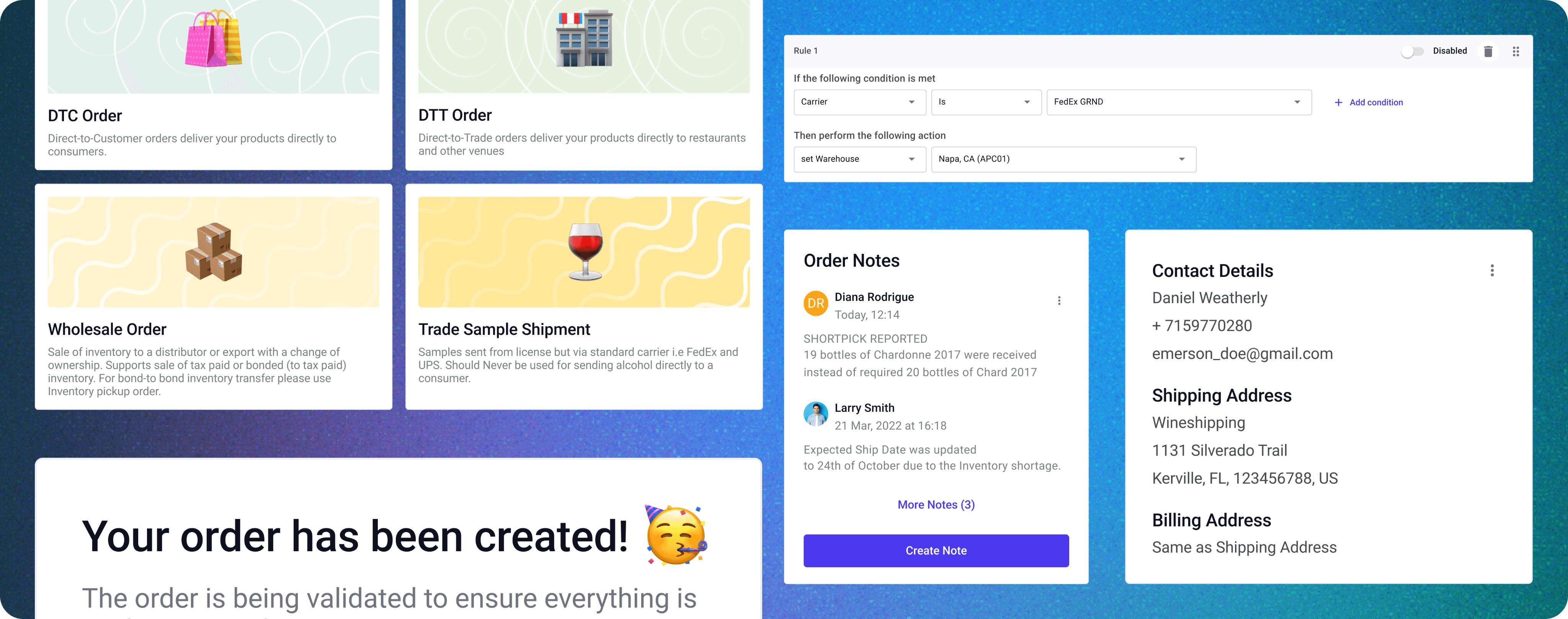
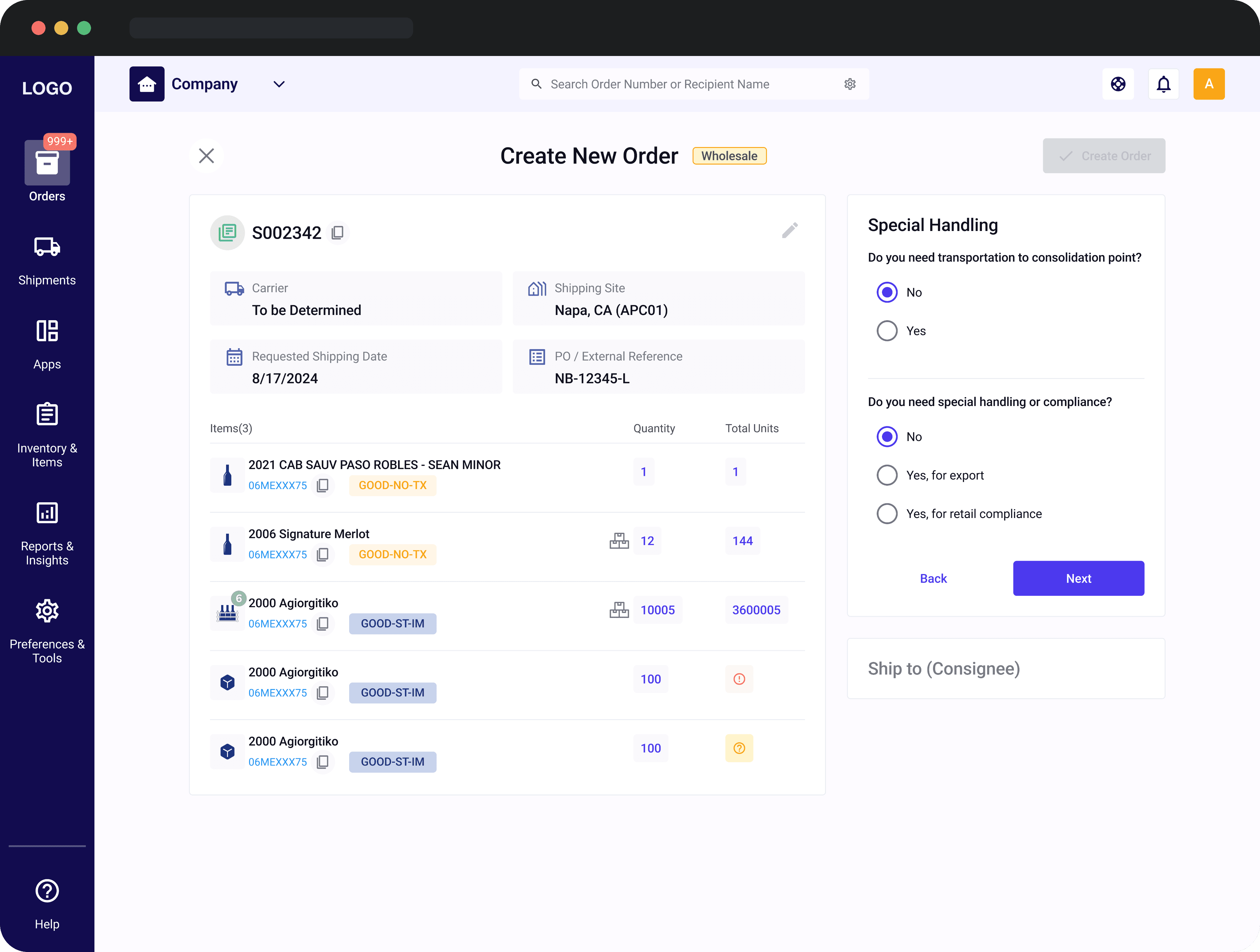
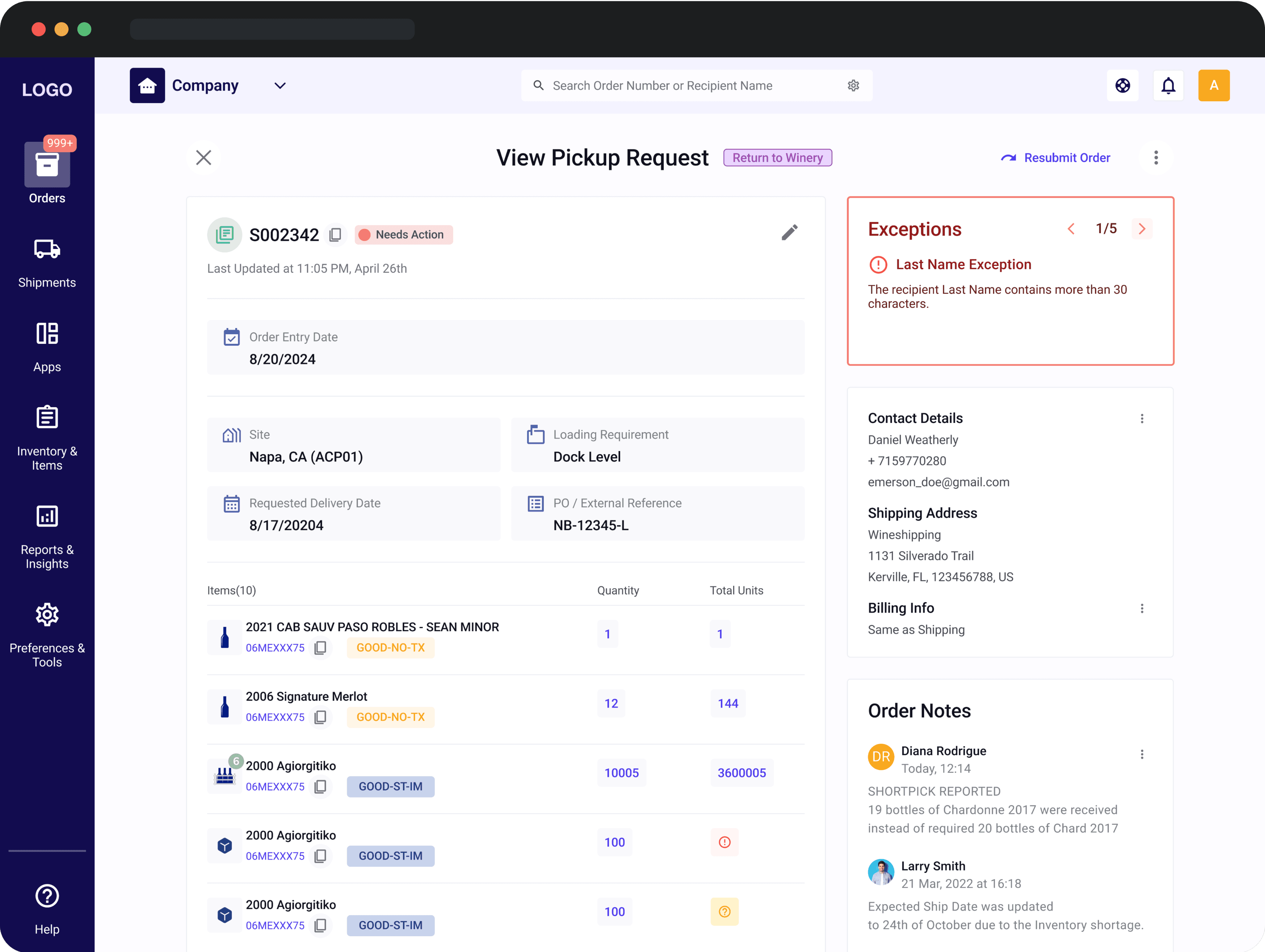
The problem went beyond buttons and icons—it stemmed from inconsistent interaction patterns. For instance, the "Create Order" button opened a window in one case but navigated to a new page in another, leading to user confusion.
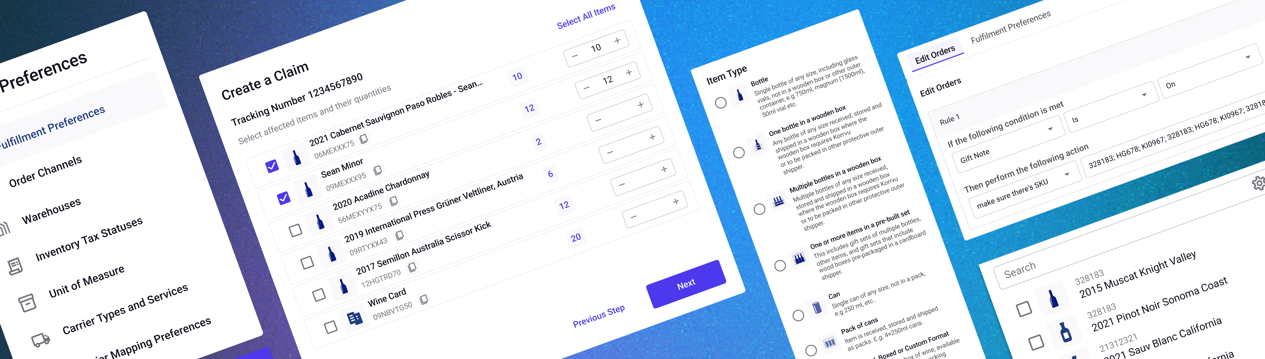
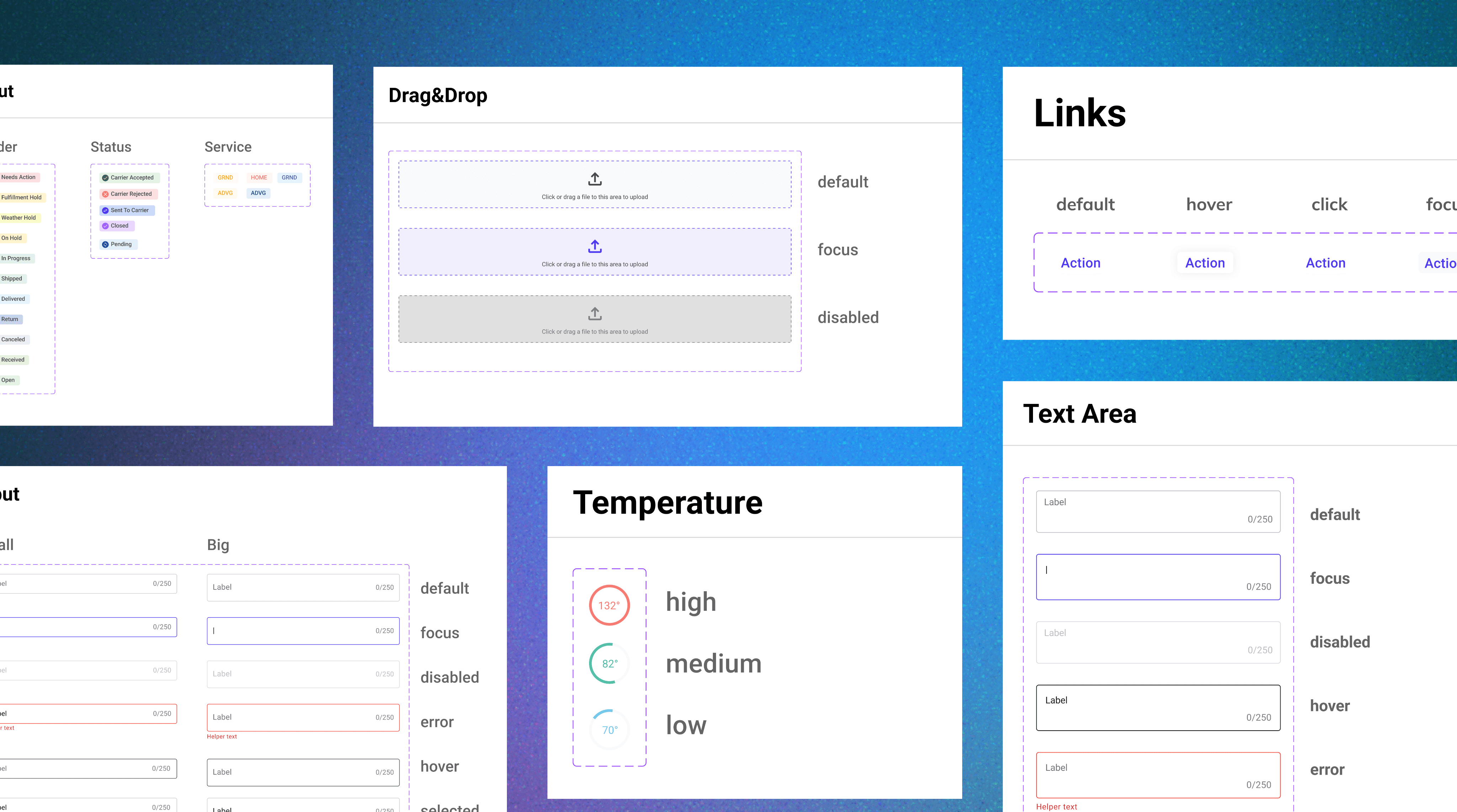
After identifying key issues and securing stakeholder approval, I decided to implement a Design System. To save time, I built it on the MUI foundation, tailoring it to match our branding
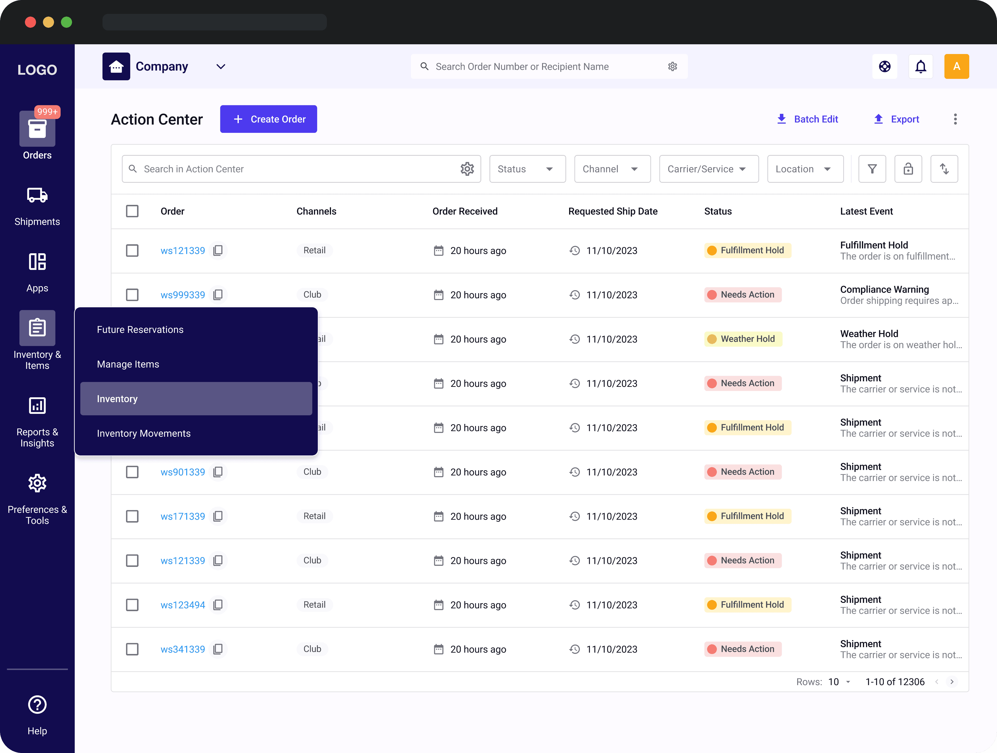
The navigation relied heavily on a side panel that had grown into a long list, making it hard for users to find what they needed. On top of that, the top bar was overloaded with too many actions.
I used quantitative data to group frequently visited pages logically, creating a more user-friendly structure. The side navigation was redesigned to highlight the current section and offer quick access via hover pop-ups, while the top navigation was simplified for smoother usability.


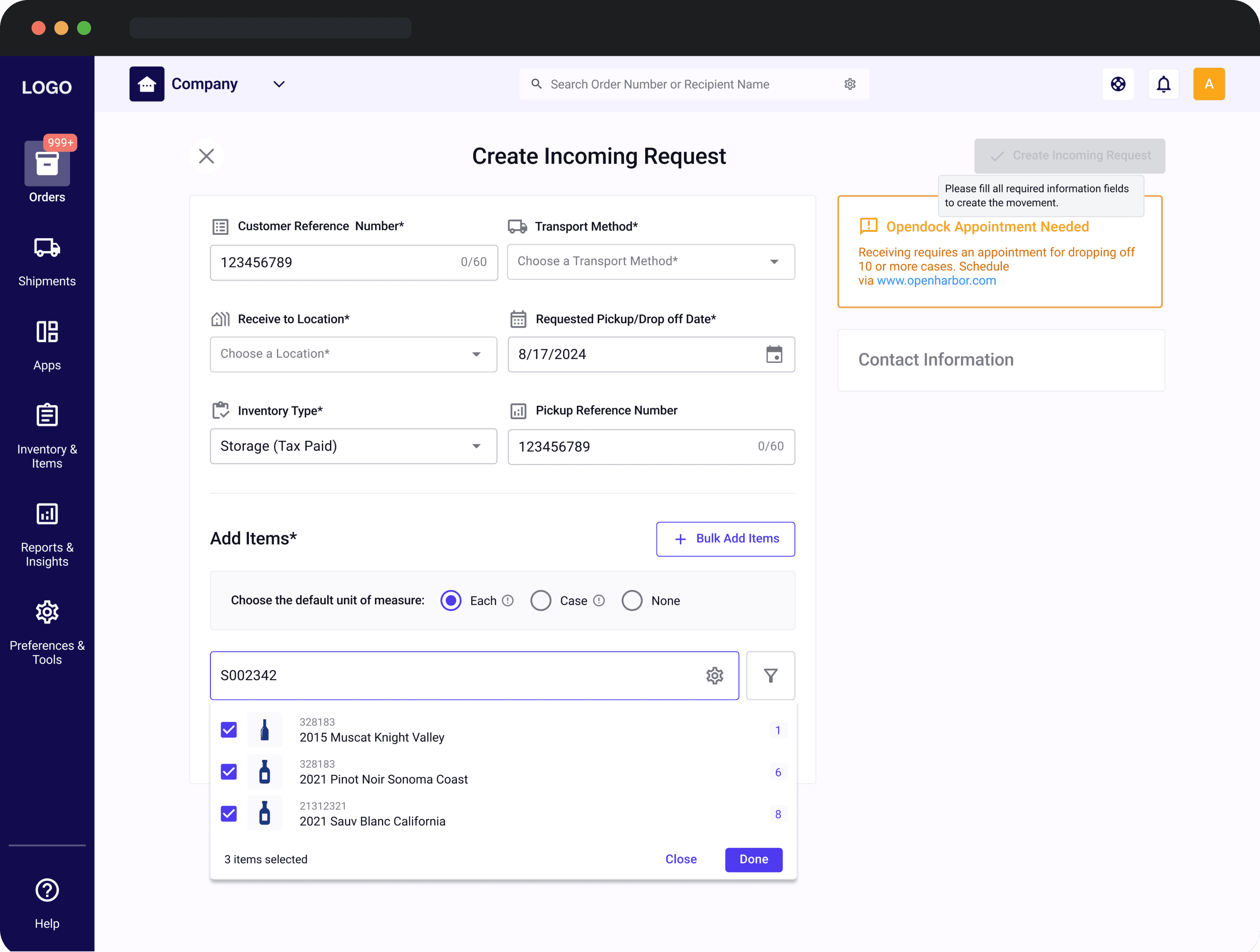
The create, edit, and view order flows were structured and designed so differently that they felt like entirely separate experiences.
To unify the create, edit, and view order flows, I focused on consistency by:
• Combining key order details on one screen.
• Organizing information into clear, labeled sections.
• Refining labels and instructions to reduce errors.
• Standardizing layouts for intuitive navigation.

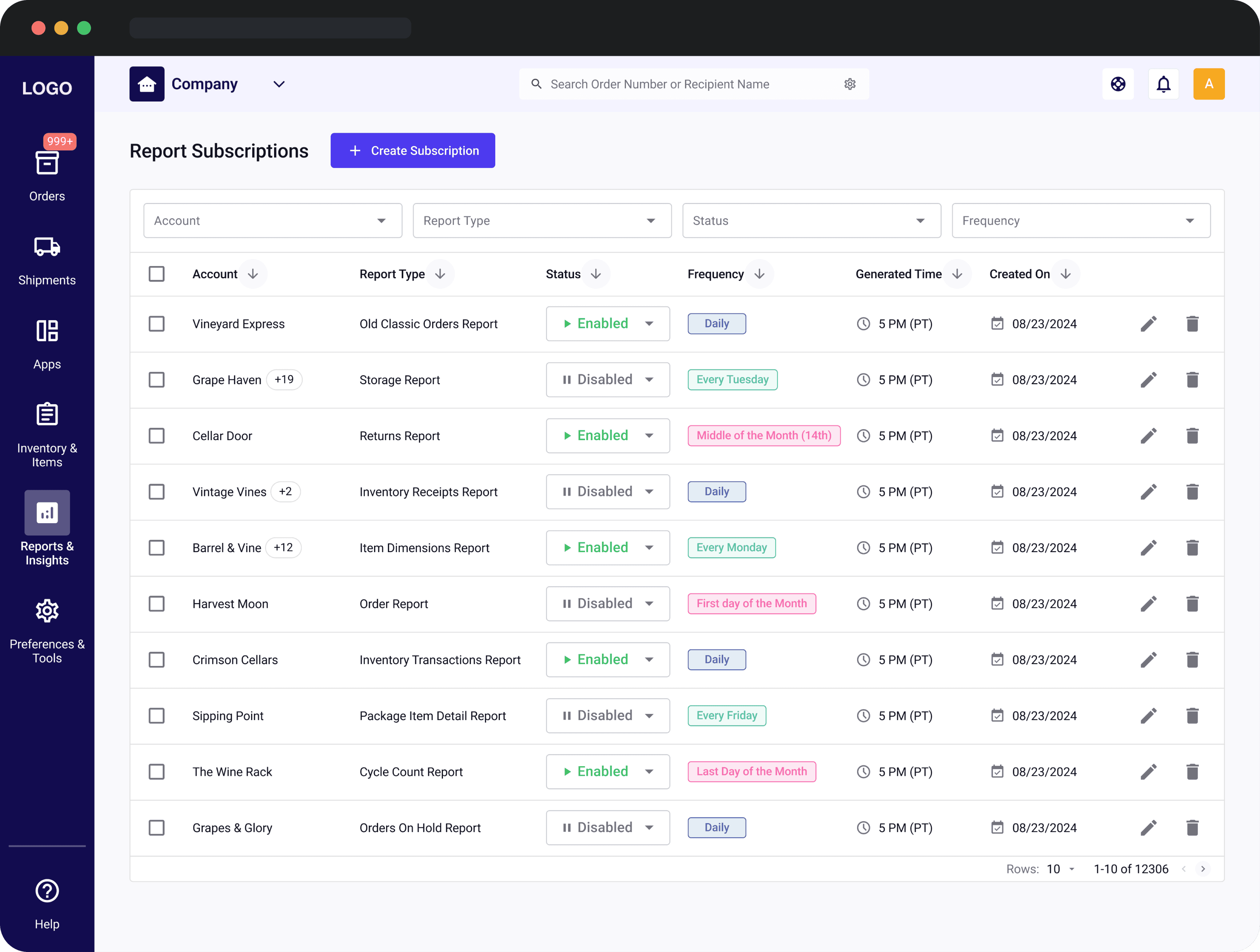
In the original product, user preferences were scattered across various pages, making it hard for users to locate and manage settings.
I brought all preferences together on one page. The design allows users to scroll seamlessly or jump to specific sections via a sidebar.
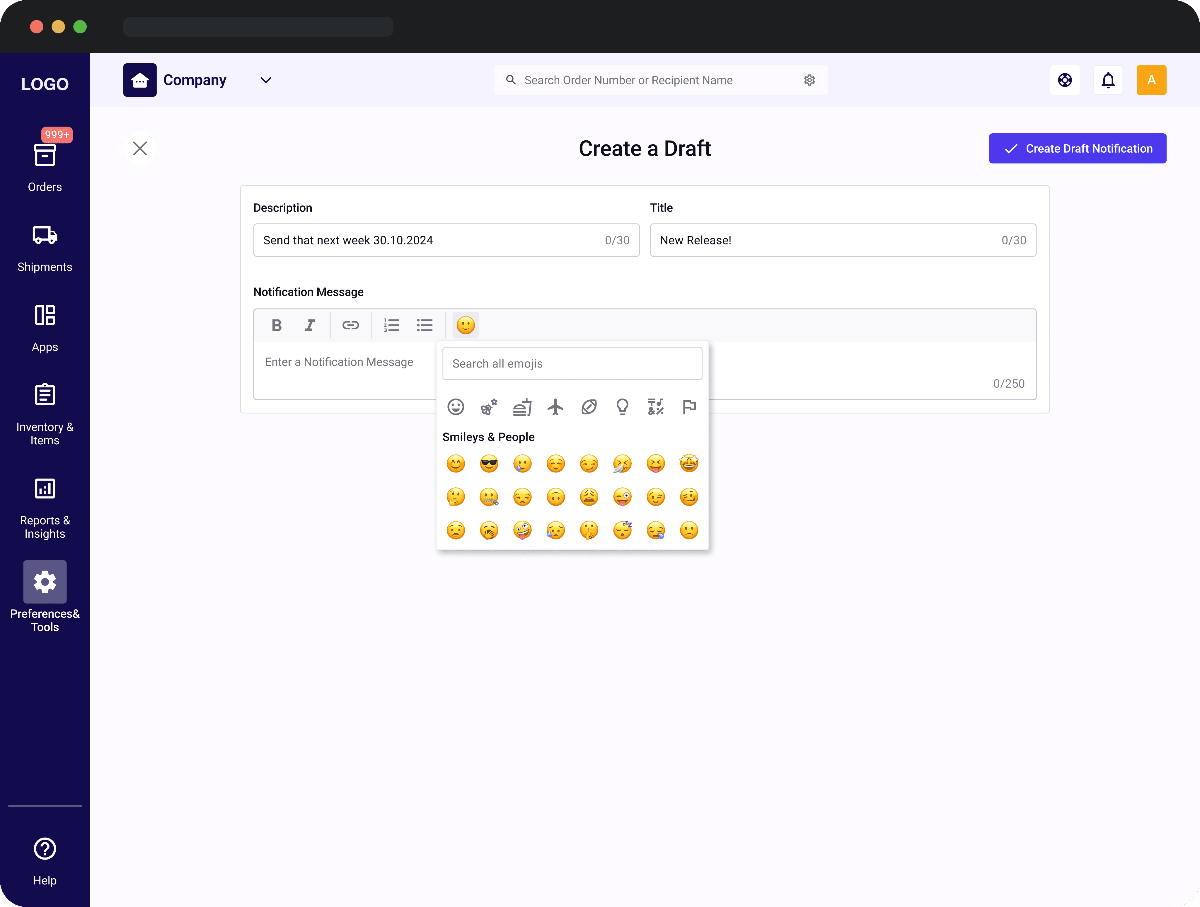
Users struggled with email-only notifications, which were inconvenient to access while working, while the support team needed a centralized panel to manage updates efficiently.
I worked closely with the support team to create a centralized panel for drafting, editing, and publishing notifications, with text formatting options. For users, we implemented a push notification system, making it easy for them to view and filter updates directly in the portal.


Creating scalable design systems for complex platforms
Developed reusable components and consistent UI patterns to enhance usability and adaptability across the platform.

Collaborating with cross-functional teams
Worked closely with developers, product managers, and stakeholders to balance user needs and business goals effectively.

Delivering high-quality solutions under NDA constraints
Navigated confidentiality requirements to produce designs that adhered to user-centered principles while respecting sensitive information.